

Designing Patch & Apparel Logos: Famous Brands & Designers
2026-04-07
📑 Table of Contents
- Main Title
- 1. Pre-Design Research & Positioning: Lay the Foundation
- 2. Define Basic Design Requirements: Set Clear Parameters
- 3. Core Logo & Graphic Design: Create a Memorable Mark
- 4. Layout & Composition Rules: Ensure Visual Harmony
- 5. Color & Craft Matching: Make It Production-Ready
- 6. Material & Process Adaptation: Ensure Durability & Feasibility
- 7. Prototype & Effect Testing: Catch Issues Early
- 8. Final Optimization & File Output: Prepare for Production
- Final Thoughts
Patches and apparel logos are more than just decorative elements—they’re powerful tools for brand identity, storytelling, and differentiation.
A well-designed patch logo can turn a basic garment into a statement piece, while a poorly executed one can dilute your brand’s message. Whether you’re a fashion designer, a brand owner, or a graphic designer new to apparel, this step-by-step guide will walk you through the entire process of creating patches and apparel logos that align with your brand, resonate with your audience, and work seamlessly with production.
From pre-design research to final file delivery, we’ll break down each stage into simple, actionable steps, with helpful tables to clarify key decisions. Let’s dive in.
1. Pre-Design Research & Positioning: Lay the Foundation
Before picking up a design tool, you need to understand the “why” behind your patch and logo. This stage ensures your design isn’t just visually appealing—it’s strategic and purposeful.
Start by clarifying your brand’s core identity. What values do you want to convey? Is your brand edgy and streetwear-focused, classic and timeless, or functional and outdoor-oriented? Your patch logo should mirror these traits to maintain consistency across your apparel line.
Next, analyze your target audience. Their preferences, lifestyles, and style choices will dictate everything from color to design complexity. For example, a teen streetwear brand might opt for bold, playful patches, while a luxury workwear brand would lean toward sleek, minimalist designs.
Researching industry trends and competitors is also critical. Look at what other brands in your niche are doing—what works, what feels overdone, and where you can stand out. Avoid copying, but use this insight to identify gaps in the market.
|
Brand Style
|
Target Audience
|
Patch Design Direction
|
|---|---|---|
|
Streetwear
|
Teens & Young Adults (16-25)
|
Bold graphics, vibrant colors, oversized patches, graffiti-inspired elements
|
|
Outdoor/Adventure
|
Outdoor Enthusiasts (25-45)
|
Minimalist, durable materials, earthy tones, nature-inspired icons
|
|
Luxury Fashion
|
Affluent Adults (30-55)
|
Sleek lines, neutral colors, small/understated patches, high-end materials (leather, metallic)
|
|
Workwear
|
Manual Laborers & Tradespeople (25-50)
|
Durable, functional, clear branding, high-visibility colors
|
Finally, confirm the functional purpose of your patch. Is it purely decorative, or does it serve a practical role (e.g., brand identification, anti-counterfeiting, or conveying information like size or material)? This will impact every design decision moving forward.
2. Define Basic Design Requirements: Set Clear Parameters
Once you have a solid research foundation, it’s time to establish the non-negotiable details of your patch. These parameters will keep your design focused and ensure it’s feasible to produce.
First, choose the patch type. The material and construction of your patch will affect its look, durability, and cost. Each type has unique advantages and limitations, so select one that aligns with your brand, budget, and garment type.
|
Patch Type
|
Key Features
|
Best For
|
|---|---|---|
|
Embroidered Patch
|
Textured, durable, 3D effect, available in multiple thread colors
|
Streetwear, workwear, outdoor apparel, classic brands
|
|
Woven Patch
|
Smooth, detailed, thin, ideal for small text/logos
|
Luxury brands, delicate garments (blouses, lightweight jackets)
|
|
Silicone Patch
|
Soft, flexible, water-resistant, bold colors
|
Athletic wear, swimwear, outdoor gear
|
|
Leather Patch
|
Elegant, durable, natural texture
|
Luxury brands, denim, jackets, workwear
|
|
Printed Patch
|
Full-color, photo-realistic, cost-effective for complex designs
|
Trendy, short-run collections, bold graphics
|
Next, determine the size, shape, and placement of the patch. Size should be proportional to the garment—an oversized patch works well on a jacket back, while a small patch is better for a chest or sleeve. Common shapes include rectangular, round, shield, and irregular (custom shapes that match your logo).
Placement is equally important. Chest (left or right) is the most common spot for brand logos, while sleeves, hems, and hat brims are great for secondary patches. Consider how the patch will interact with the garment’s seams and design elements to avoid a cluttered look.
Finally, set color guidelines. Your color palette should match your brand’s existing colors and the garment’s fabric. Avoid using too many colors—this increases production costs and can make the patch look chaotic. Stick to 3-5 core colors for the cleanest, most cost-effective design.
3. Core Logo & Graphic Design: Create a Memorable Mark
The heart of your patch is the logo or graphic. This is what will make your brand recognizable, so it’s crucial to design something that’s simple, versatile, and aligned with your brand identity.
Start by simplifying your brand logo (if you already have one) for patch application. Patches are often small, so intricate details (like tiny text or complex patterns) will get lost. Focus on bold lines, clear shapes, and a strong focal point. For example, if your logo has a detailed illustration, simplify it to its most essential elements.
Font selection is another key element. Choose a font that matches your brand style—bold sans-serif fonts work for streetwear and workwear, while elegant serif fonts are better for luxury brands. Avoid overly decorative fonts that are hard to read, especially at small sizes.
|
Brand Style
|
Recommended Font Type
|
Examples
|
|---|---|---|
|
Streetwear
|
Bold Sans-Serif, Graffiti-Style
|
Impact, Futura Bold, Spray Paint Fonts
|
|
Luxury
|
Elegant Serif, Script
|
Cormorant Garamond, Playfair Display, Calligraphy Fonts
|
|
Outdoor/Adventure
|
Rugged Sans-Serif, Hand-Drawn
|
Montserrat, Roboto, Handwritten Fonts
|
|
Workwear
|
Sturdy, Readable Sans-Serif
|
Arial, Helvetica, Courier New
|
Integrate theme elements to make your patch unique. This could include national symbols, street culture references, outdoor icons (like mountains or compasses), or your brand’s mascot. Just ensure these elements don’t overshadow the core logo—they should enhance it, not distract from it.
Balance is key here. A good patch design has a clear hierarchy: the main logo (focal point), supporting graphics (if any), and negative space (the empty area around elements). Negative space helps the design breathe and makes it more readable, especially from a distance.
4. Layout & Composition Rules: Ensure Visual Harmony
Even the most beautiful logo will fall flat if the layout is disorganized. A strong layout ensures your patch is visually balanced, easy to read, and cohesive with the garment.
Start with visual balance. This means distributing elements (text, graphics, negative space) evenly across the patch. For example, if you have a large graphic on one side, balance it with text or a smaller graphic on the other. Avoid crowding elements—leave enough space between them to prevent a cluttered look.
Align elements for neatness. Use a grid system to ensure text and graphics are centered, left-aligned, or right-aligned consistently. Centered layouts work well for circular or shield-shaped patches, while left-aligned layouts are better for rectangular patches with text.
Adapt the layout to your patch shape. If you’re using an irregular shape (e.g., a star or a custom brand shape), design the logo to fit within that shape—don’t force a square logo into a round patch. The shape should complement the logo, not compete with it.
Finally, maintain consistency with your overall apparel design language. If your garments have a minimalist aesthetic, your patch should be minimalist too. If your line is bold and colorful, the patch can reflect that—just ensure it doesn’t clash with the garment’s pattern or color.
5. Color & Craft Matching: Make It Production-Ready
Color choice isn’t just about aesthetics—it also affects how your patch looks in production and how well it holds up over time. The right color-craft combination ensures your patch is vibrant, durable, and cost-effective.
First, prioritize visibility. Choose colors with high contrast to ensure the patch stands out on the garment. For example, a white patch on a black jacket is more visible than a gray patch on a black jacket. If the garment is light-colored, opt for darker patch colors, and vice versa.
Match colors to your chosen craft. Different patch types have different color capabilities—embroidery uses thread colors, while silicone patches can achieve bold, solid colors. Some crafts (like woven patches) are better for subtle color gradients, while others (like printed patches) excel at full-color designs.
|
Patch Craft
|
Color Capabilities
|
Best Color Strategy
|
|---|---|---|
|
Embroidery
|
Thread colors (limited to thread palette), 3D texture
|
Bold, solid colors; avoid gradients
|
|
Woven
|
Subtle gradients, fine color details
|
Muted tones, complementary color pairs
|
|
Silicone
|
Bold, solid colors, neon options
|
High-contrast color schemes; 2-4 core colors
|
|
Printed
|
Full-color, photo-realistic, gradients
|
Vibrant, complex color palettes (but keep it balanced)
|
Control the number of colors to reduce production costs. Each additional color adds time and expense, especially for embroidery and silicone patches. Stick to 3-5 colors whenever possible, and use shades of the same color to create depth without adding extra cost.
Consider color fastness and washing resistance. Apparel patches are exposed to washing, sunlight, and wear, so choose colors that won’t fade or bleed. Ask your manufacturer about color fastness ratings, and test sample patches to ensure they hold up over time.
6. Material & Process Adaptation: Ensure Durability & Feasibility
Your patch’s design must work with its material and attachment method—otherwise, it may look unprofessional or fall apart after a few washes. This stage is all about adapting your design to the practical realities of production.
Adjust line thickness for your chosen craft. Embroidery, for example, can’t handle overly fine lines—they’ll break or become unreadable. Aim for lines that are at least 1mm thick for embroidery, and even thicker for larger patches. Woven patches can handle finer lines, but still avoid extreme detail.
Optimize curves and angles. Sharp angles can be difficult to produce with embroidery or silicone, so round off corners slightly for a cleaner finish. Curves should be smooth and gradual, not jagged—this ensures the patch looks polished and professional.
|
Material/Craft
|
Design Adaptations
|
|---|---|
|
Embroidery
|
Thick lines (≥1mm), rounded corners, avoid tiny text, use fill stitches for large areas
|
|
Silicone
|
Smooth curves, avoid sharp angles, bold graphics, no fine details
|
|
Woven
|
Fine lines allowed, subtle details, avoid large solid color areas
|
|
Leather
|
Simple, bold designs, laser-engraved details (avoid complex graphics)
|
Ensure the edge design is firm and durable. The edge of your patch should be clean and secure—frayed edges look unprofessional and reduce longevity. For embroidered patches, use a merrowed edge (folded and stitched) for durability. For silicone and leather patches, a clean, cut edge works best.
Adapt to the attachment method. Patches can be sewn on, ironed on, or adhesive. Sewn-on patches are the most durable, but they require extra production time. Iron-on patches are convenient but may not hold up as well to frequent washing. Adhesive patches are best for temporary use. Design your patch with the attachment method in mind—for example, iron-on patches need a heat-resistant backing.
7. Prototype & Effect Testing: Catch Issues Early
No design is perfect on the first try—prototyping and testing are critical to ensuring your patch looks and performs as intended. This stage helps you catch mistakes before mass production, saving time and money.
Start with digital mockups. Use design software (like Adobe Illustrator or Photoshop) to place your patch design on a garment template. This helps you visualize how the patch will look on the actual garment, including size, placement, and color contrast. Share mockups with your team or clients for feedback.
Produce physical sample patches. Digital mockups are helpful, but nothing beats seeing and touching a physical sample. Work with your manufacturer to create 1-3 samples of your patch, using the exact material, craft, and colors you’ve chosen.
Test the wearing effect, comfort, and firmness. Attach the sample patch to a garment and wear it for a few days. Check if it’s comfortable (no scratchy edges), if it stays in place, and if it looks good from different angles. Ask others for feedback—sometimes a design that looks great on paper doesn’t work in real life.
Test durability by washing the garment according to care instructions. Check if the patch fades, bleeds, or comes loose after washing. If the patch is intended for outdoor or workwear, test it in harsh conditions (e.g., rain, dirt) to ensure it holds up.
8. Final Optimization & File Output: Prepare for Production
Once you’re happy with the sample, it’s time to finalize the design and prepare the files for production. This stage ensures your manufacturer has all the information they need to create consistent, high-quality patches.
Revise details based on sample feedback. If the sample had issues (e.g., a color was too light, a line was too thin), make adjustments to the design. This is your last chance to fix mistakes, so be thorough.
Standardize your design files. Manufacturers require vector files (AI, PDF, EPS) for production—vector files are scalable and ensure the design stays sharp at any size. Avoid raster files (JPG, PNG) unless they’re high-resolution (300 DPI or higher), as they can become blurry when scaled.
Mark all specifications clearly. Include details like patch size, color codes (Pantone or CMYK), craft type, edge style, and attachment method. This ensures there’s no confusion during production and that every patch matches your vision.
Provide seam allowance guidelines. If the patch will be sewn on, mark the seam allowance (usually 3-5mm) around the edge of the design. This helps the manufacturer position the patch correctly and ensures a clean, secure stitch.
Final Thoughts
Designing patches and apparel logos is a mix of creativity and practicality. By following these steps—from research and positioning to final file output—you’ll create a patch that not only looks great but also serves your brand’s goals and works seamlessly with production.
Remember, the best patch logos are simple, consistent, and aligned with your brand. Don’t overcomplicate the design—focus on what makes your brand unique, and let that shine through. With the right planning and attention to detail, your patch will become a memorable part of your apparel line.
Whether you’re designing your first patch or refining an existing one, this guide will help you navigate the process with confidence. Now, grab your design tools and start creating!
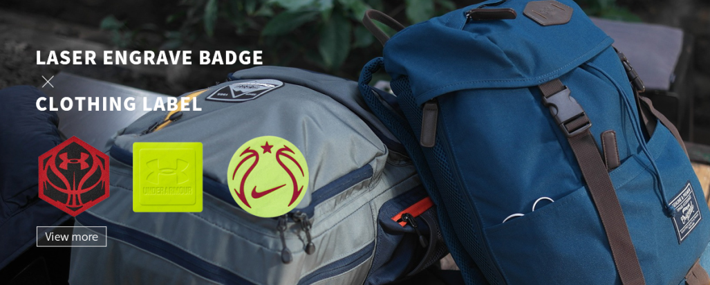
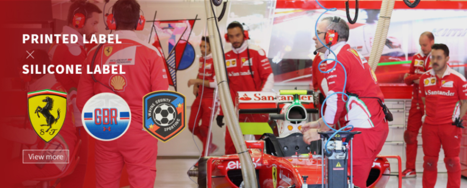
PEPHAWK is proud to highlight our integrated one-stop service—seamlessly combining professional design, R&D, and manufacturing capabilities to deliver cohesive, end-to-end solutions for our valued clients.
Our core product range covers a diverse selection of high-quality accessories and silicone-based items, including:
- Garment Accessories: Silicone Labels, Micro Fiber Labels, TPU Labels, Leather Labels
- Electronic & Lifestyle Gadgets: Silicone Mobile Phone Skins, Silicone MP3 Skins, Silicone Chaplets, Silicone Bracelets
Beyond our core offerings, we also connect clients with complementary products through our trusted affiliated companies, ensuring all your needs are met under one partnership.
What sets us apart is our specialized expertise in key manufacturing processes: Silk Screen Printing, High-Frequency Welding, Sublimation Printing, Seamless Fabric Processing, and Laser Cutting. These capabilities allow us to serve a wide array of industries—from garments, shoes, caps, and gloves to electronic devices, bags, and sporting equipment—with products that blend durability, functionality, and aesthetic appeal.
At PEPHAWK, customer satisfaction is our top priority. We’re committed to providing responsive, thorough support, and guarantee a same-day response to all inquiries—no exceptions. You can rely on us for consistent quality, reliable delivery, and a partnership that’s as efficient as it is trustworthy.
Whether you’re looking for custom apparel labels, protective silicone skins, or tailored manufacturing solutions, PEPHAWK has the expertise and flexibility to bring your vision to life.
Styling & Matching Stick-on Fabric Patches: Easy Tips for a Stylish Upgrade
Iron-On Name Transfers for Easy, Custom Identification




SEND MESSAGE