

How Does a Gray Logo Impact Consumer Perception
2025-01-15
Elevate your brand with our gray logo designs. Browse through unique options that reflect professionalism and creativity, tailored for your business needs.
In the realm of branding and marketing, the choice of color for a logo plays a crucial role in shaping consumer perception. Gray, often associated with neutrality, sophistication, and balance, is a color that can significantly impact how a brand is perceived by its target audience. This article will explore the psychological impact of gray in branding, the associations it carries, and how it can be effectively used in logo design to enhance brand identity and consumer engagement.
The Psychological Impact of Gray in Branding
Colors have a profound impact on our emotions and perceptions, and gray is no exception. It often represents neutrality, balance, and sophistication, making it a popular choice among luxury brands. Gray delivers a message of balance and calmness, allowing other elements of the design to stand out without overwhelming the viewer. This neutrality can evoke a sense of power and sophistication, providing a clean slate for bold concepts.
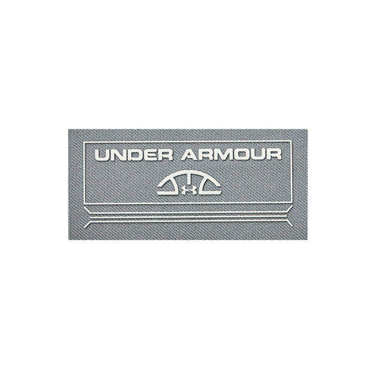
Gray’s Neutrality and Sophistication
Gray is often associated with neutrality and sophistication, making it a popular choice among luxury brands. It delivers a message of balance and calmness, allowing other elements of the design to stand out without overwhelming the viewer. Ignyte Brands highlights how gray's neutrality can evoke a sense of power and sophistication, providing a clean slate for bold concepts.
Associations with Modernity and Minimalism
In the realm of modern and minimalist design, gray stands as a symbol of elegance and simplicity. Its understated presence allows for a focus on form and function, removing any distractions. This association with modernity is why you'll often find gray featured prominently in contemporary branding efforts.
Using Gray Effectively in Logo Design
Incorporating gray into logo design requires a thoughtful approach to ensure it aligns with the brand's identity and message.
Combining Gray with Other Colors
Gray's versatility shines when paired with other colors. It harmonizes beautifully with colors like blue, green, and even more unconventional choices like rose gold or mint green. Graphics Springs suggests these combinations make for striking and effective designs that capture attention while maintaining a sense of elegance.
Case Studies of Successful Gray Logo Designs
Many well-known brands utilize gray effectively in their logos. Brands like Apple and Mercedes-Benz use gray to convey a message of reliability and sophistication. These brands demonstrate how the choice of color in logo design can communicate the core values of a company, from innovation to luxury. For more insights, Tailor Brands offers guidance on whether a gray logo could be right for your business.
Trends in Gray Color Palette
As we move into 2025, the trends in gray usage in design continue to evolve. Designers are finding new ways to harness gray's potential across various mediums.
Sustainable and Eco-Friendly Design Trends
Gray is playing a significant role in the sustainable design movement. Its neutrality makes it a perfect backdrop for highlighting eco-friendly initiatives. As sustainability becomes more important, gray is being used to symbolize balance with nature and simplicity in design.
Digital and Print Design Considerations
In digital design, gray's adaptability across different screens and devices is invaluable. However, considerations must be made for print, where gray can sometimes appear different due to the medium. Understanding these nuances ensures your design retains its intended impact regardless of the format.
The Different Shades of Gray
Gray isn't just gray; it's a spectrum that ranges from light to dark. Light grays, like ash, bring softness and tranquility, while dark grays, such as charcoal, add depth and sophistication. Mid-tones like slate offer balance, making them perfect for designs that require neutrality and harmony. For inspiration, sites like Color Hunt provide beautiful gray palettes that can spark your creativity.
Warm vs. Cool Grays
Just as with any color, grays can lean toward being warm or cool. Warm grays have undertones of brown or taupe, which can add a cozy, inviting feel to your design. On the flip side, cool grays, with blue or green undertones, bring a crisp, modern vibe. The choice between warm and cool grays can significantly affect how your brand is perceived. According to Better Homes & Gardens, understanding these nuances can help in selecting the right shade to align with your brand's personality.
Conclusion
Gray is a versatile and sophisticated color that can significantly impact consumer perception in branding. Its neutrality and association with modernity make it a popular choice for luxury and technology brands. By understanding the psychological impact of gray and using it effectively in logo design, brands can enhance their identity and engage with consumers on a deeper level. Whether used alone or in combination with other colors, gray can create a timeless and elegant brand image that exudes professionalism and sophistication.
If you're facing the challenge of completing complex design drafts with impeccable quality, look no further than PEPHAWK. Our 16 years of experience and our general manager's 31 years of silicone industry involvement make us the ideal choice to solve your difficult and complicated logo design problems. Choose the expertise of PEPHAWK and feel confident in the flawless results that we deliver.
Trends in Football Team Logo Design
What Are the Best Practices for Match Logo Creation




SEND MESSAGE