

Tips for Designing Logos with Best Colors
2024-12-24
Learn about the best colors for logos that resonate with your audience. Enhance your brand's appeal with our comprehensive color selection guide.
A well-designed logo can help businesses establish a strong brand identity. One essential element to consider in designing a logo is color choice. Color plays a critical role in building a connection with the audience and evoking a particular emotion or association. In this guide, we will provide some tips and best practices for designing logos with best colors.
Understanding Color Psychology
In logo design, color psychology is vital to evoke specific emotions and associations in the audience. For example, blue conveys a sense of reliability and conservatism, green represents growth and health, while yellow is associated with happiness and positivity. Understanding color theory can help choose the right color or color palette that fits the brand value and message.
Tips for Choosing the Right Colors for Logos
Selecting the right colors for a logo should align with the brand's overall message, content, and audience. This means considering the brand's values and the message that the company wants to convey. Analyzing the brand's audience is also important when selecting colors. The age, gender, and demographic of the target audience will determine which colors can best connect to their preferences.
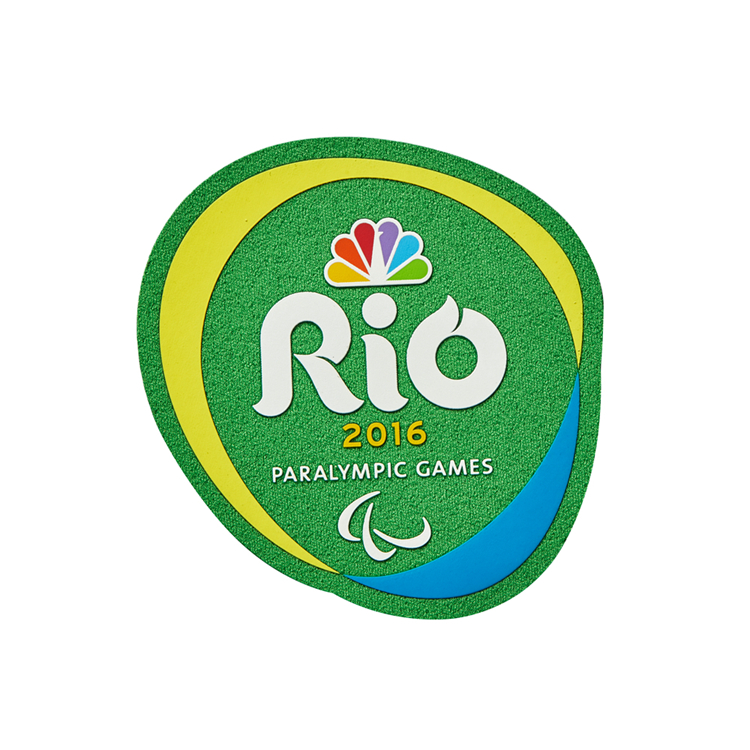
When selecting colors, it's highly recommended to use a color combination. Combining colors will help give uniqueness to the logo and avoid common preconceptions of specific colors. A well-chosen color combination can quickly create a strong identification for the brand and establish brand loyalty.
It's also essential to test the logo's design in black and white, which can highlight specific aspects of the design that might not be evident when viewing it in color. The logo's readability and the font size must be tested for maximum visibility to ensure that it stands out everywhere the logo is placed, whether digitally or physically.
Another point to consider when selecting colors is the contrast and legibility of the logo. The logo design must carry out both lighting conditions, whether dark backgrounds or light. A logo designed for primarily light backgrounds might get lost on a black or dark background, which results in a decreased legibility of the logo. A carefully chosen color scheme paired with a good balance of white space will not only improve the legibility but also the memorability of the logo.
Best Practices for Color Application of Logos
While following trends can sometimes be tempting, it's vital to avoid it when it comes to designing logos. Trendy colors come and go too quickly, and the brand identity might suffer from it. It's best to select foundational colors that fit the brand's overall message and philosophy.

Colors can also be resourceful in differentiating a brand from others in the same industry. Colors can carry a deeper meaning beyond recognizing the brand, such as evoking specific emotions in the target audience. However, consistently using the same colors across various platforms and communication materials is essential in building a strong brand identity.
Lastly, it's crucial to avoid using too many colors in a logo. Using too many colors can diminish the visual impact of the logo design. The most memorable logos are often the simplest. Fewer colors, paired with a good balance of white space, will make the brand's logo stand out from other competitors and make it recognizable and memorable.
Designing for Color Accessibility
Another essential aspect of designing logos with best colors is to ensure color accessibility for everyone. This includes taking into account color blindness and other color-vision deficiencies. There are specific color combinations that work best for color accessibility, such as black and white or dark blue and light yellow.
Conclusion
Choosing the right colors for a logo is essential for establishing a strong brand identity and generating recognition among the audience. Taking into account color psychology, brand values and message, contrast, legibility, accessibility, and consistency are all crucial when deciding on the best colors for a logo. By following these tips and best practices, businesses can create logos with best colors that resonate with their audience and elevate their brand identity.
If you're looking for a reliable partner to help you design a logo with the best colors for your business, look no further than PEPHAWK. Our integrated services, including design, research, development, and production, ensure that you get top-quality products every time.
Prioritizing Your Company Logo Orange To Get The Most Out Of Your Business
How to Choose Colors for Your Generic Baseball Logo




SEND MESSAGE